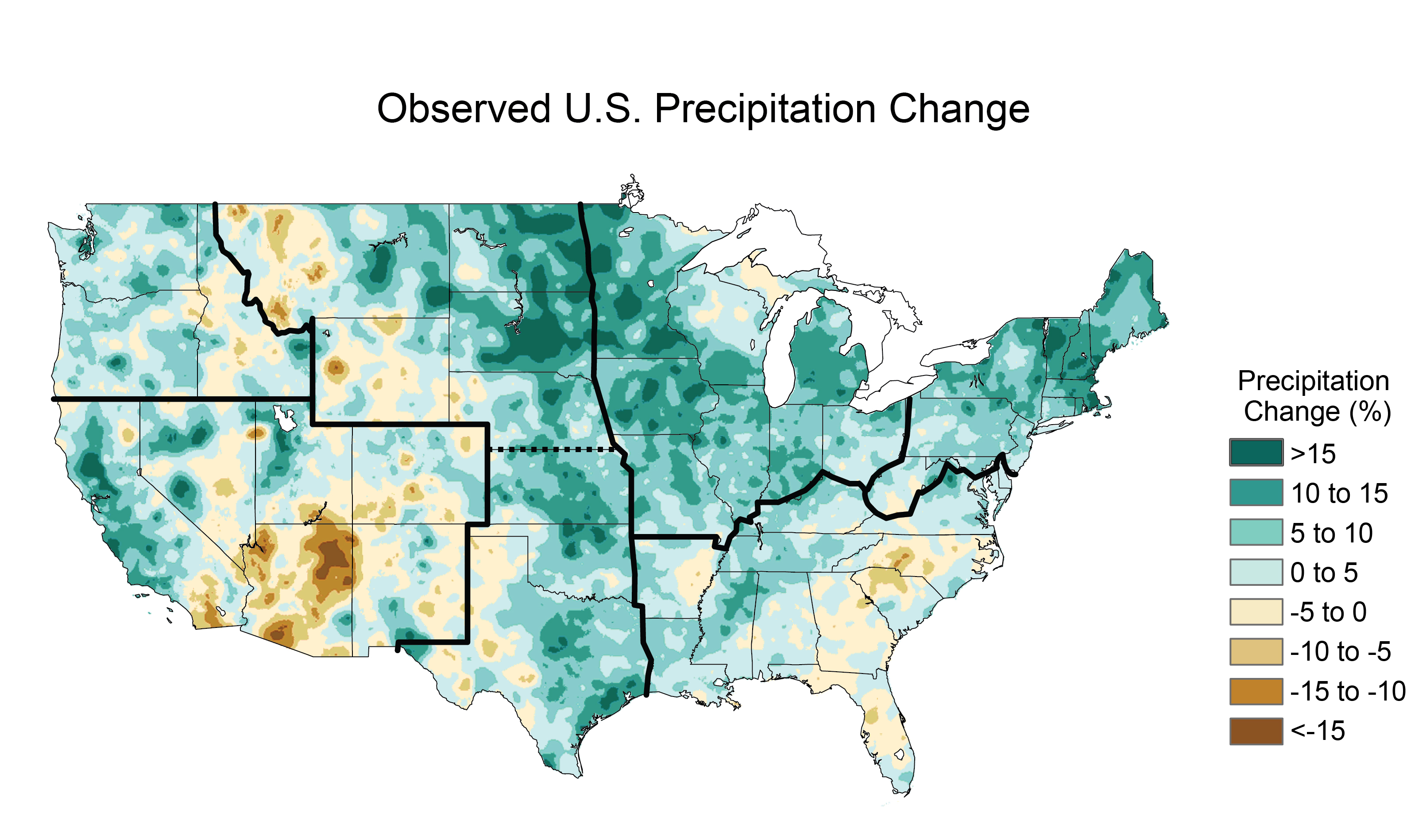
As a farmer/rancher, I'm happy not to live in the "1930s" region of that graph. I've never understood why people in North America complain about rain. The land we have that is vulnerable to flooding is tiny in comparison to that which is vulnerable to desertification.
The time period isn't indicated on that map, but since I'd like to see the dairy industry leave Arizona and move back to the Midwest where it naturally belongs, I frankly don't see a problem there. The sooner they have to stop irrigating their alfalfa, the better.
No American farmer would need a chart to be thankful not to face 1930s' conditions.
According to the URL, it appears to be 1991-2012 changes in precipitation. I suspect the filename is trustworthy (based solely on it coming from NASA) but it might not be.
You should see the tech on a modern farm. Self driving farm equipment, drones that scout for deer in the fields and scare them off so they don't get reaped, satellite analysis of fields to analyze the best crop locations and disease/pests. Solar and wind electricity, water filtration and geo cooling/warming.
Honestly a not-poor farm makes most city neighborhoods look like the third world in terms of tech.